Box Art
Top 10 Examples of Great Video Box Art!
It’s often said that you can’t judge a book by its cover, but we’re also told that you only have one chance to make a first impression. Art is subjective, but I’m aiming to highlight games that stand out on store shelves. Ideally, the art on the cover of a video game should speak to the player and communicate what the game is all about. When done right, a game’s cover elaborates the visual language of video games. Click the images for a full preview!
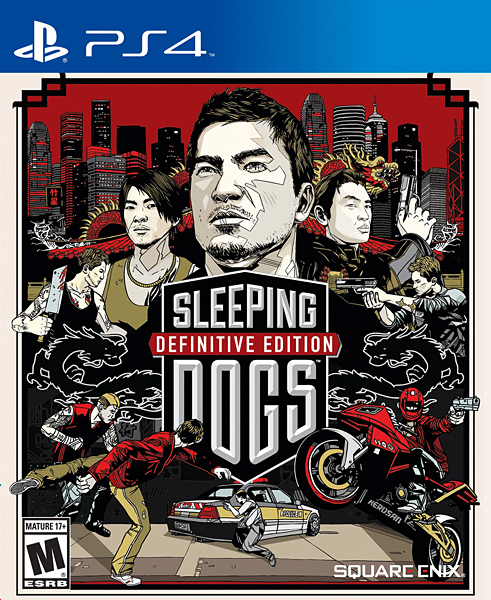
10
Sleeping Dogs
2012
Tyler Stout made a name for himself by designing incredible alternate movie posters. He approached Sleeping Dogs with the same energy, since Square Enix wanted to capture a cinematic feel for their open-world crime game. Stout was given the game’s script to read through and was able to create a cover that touched on the game’s central themes. The art highlights the duality of a man who skirts the line between the criminal underworld and law enforcement, and an emphasis is placed on action and violence. The cover of the game looks like a Hong Kong action movie, and that’s exactly what Square Enix was aiming for.
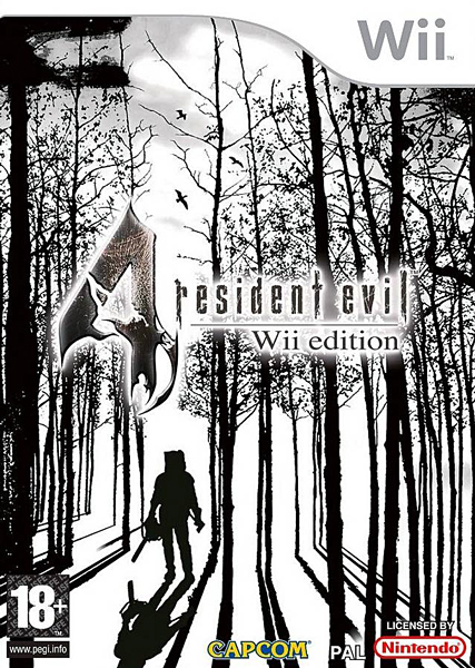
9
Resident Evil 4
2005
The cover art for Resident Evil 4 looks different depending on what system you buy it for and what part of the world you live in. None of the designs are especially offensive, but I’m partial to the ones that employ a simple silhouette motif. Some versions use a black-and-red color scheme while others opt for black-and-white, but both would be a perfect fit for the Criterion Collection. The minimalist artwork grabs your attention immediately. The shadowy figure is the focal point of the piece, but the lack of fine detail adds an element of mystery. The chainsaw wielding fiend looks at home amongst the trees, and this makes the entire forest look scary by proxy.
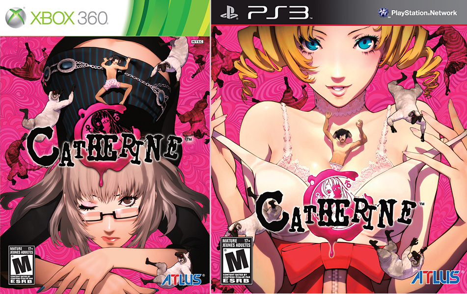
8
Catherine
2011
At the heart of Catherine lies one of the most dramatic love triangles in video game history. Vincent Brooks finds himself torn between his long-time girlfriend and a seductive home wrecker who probably does butt stuff. Decisions, decision. When you have two hot girls pining over you, it can be hard to choose. Atlus apparently had trouble choosing as well, so they opted to feature both of them. The Xbox 360 version of the game features Katherine down on all fours while the PlayStation 3 puts the spotlight on the salacious Catherine. The covers were too sexy for sensitive eyes, so the suggestive artwork was cropped on some copies in order to appease retailers.
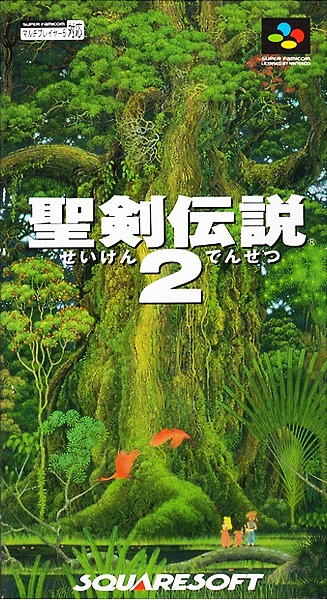
7
Seiken Densetsu 2
1993
Secret of Mana featured some of the most vibrant cover art found on a Super Nintendo game, but its Japanese counterpart provides a better view of the artwork. (The horizontal orientation of SNES boxes cropped off most of the picture, but Seiken Densetsu 2 for the Super Famicom gives a relatively unobstructed look at the magnificent Mana Tree.) The vivid colors make everything feel organic and peaceful, and you’d be hard-pressed to find a game cover that looks more serene. The title screen for the game mirrors the artwork on the box, but the poster-worthy scene is a little too elaborate for a 16-bit system to replicate.
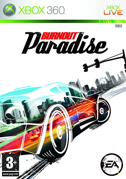
6
Burnout Paradise
2008
The Burnout series revolves around intense action and spectacular collisions, so it was surprising to see how streamlined the cover for Burnout Paradise was. If nothing else, it was a nice change of pace from earlier Burnout titles. The blurred reflection of the cars and the pronounced tire marks on the ground evoke a sense of speed, but the chaotic explosions that informed the design language of previous Burnout covers are nowhere to be seen. Box art on past Burnout games accurately depicted the action, but it also made the game look ike every other arcade racer on the market. Burnout Paradise stands out on store shelves thanks to its bold artwork.
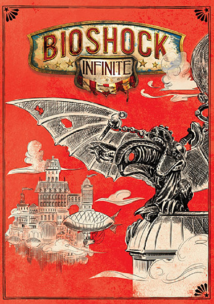
5
Bioshock Infinite
2003
Bioshock Infinite was criticized prior to its release because its cover art wasn’t imaginative enough. The cover featured the game’s main protagonist holding a shotgun over his shoulder, but critics wanted a more nuanced design. The game’s director (Ken Levine) addressed the controversy by explaining that the art was generic-looking because they wanted the game to appeal to mass audiences. As a compromise, the game released with a reversible cover. The alternate artwork may have been a little to surreal for the general public, but it was more in line with what gaming enthusiasts were looking for. A number of alternate designs were also made available online.
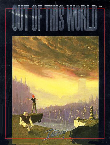
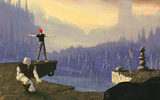
4
Out of This World
1991
Out of This World drops you off in a hostile world and provides no direction. As players navigate through desolate wastelands and contend with the unknown, there’s nothing for them to fall back on aside from their own problem-solving capabilities. The box art used for most versions of the game does a perfect job of capturing the “me vs. the world” mentality that the game emphasizes. (Eric Chahi designed the game and created the cover art, so nothing was lost in translation.) Predictably, the cover for the SNES and Genesis versions of the game were redesigned and the understated themes conveyed in the original artwork were nowhere to be seen.
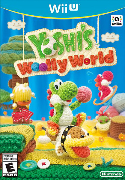
3
Yoshi’s Wooly World
2015
No entry on this list does a better job of capturing the feeling of a game than Yoshi’s Wooly World. The cover art mirrors the game’s unique fabric-based art style perfectly and just screams “Nintendo.” Nintendo was so proud of the cover that they dedicated an entire segment to its inception during their main 2015 E3 presentation. During the development of the game, designer Emi Watanabe was looking for a way to contribute to the project and took it upon herself to make her own real-life yarn Yoshis. Her colleagues were taken aback at how amazing her creations looked and a proposal was made to make yarn Amiibos to coincide with the game’s release.
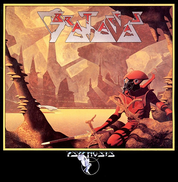
2
Brataccas
1986
In an effort to make their game boxes stand out, Psygnosis aligned with established artist, Richard Dean – who was best known for creating the album art for bands like Yes and Asia. Standing out on store shelves was paramount in 1986 since the gaming press was in its infancy, the Internet was only used for research, and the Blockfort.com revolution hadn’t begun. This entire list could have been comprised entirely of Richard Dean paintings, but Brataccas marked his entry into the gaming industry and stands as one of his most interesting pieces. The art was later used by English-based rock band, Uriah Heep, for the cover of their 2001 greatest hits album.
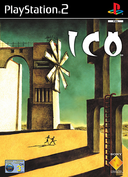
1
ICO
2001
ICO is invariably mentioned every time the “games as art” debate arises, and it only seems fitting for the game’s cover to reflect its artistry. The cover used in Japan and PAL regions was drawn by the game’s director (Fumito Ueda) and inspired by the work of Giorgio de Chirico. The cover of Ico bares a striking resemblance to de Chirico’s Nostalgia of the Infinite, and Ueda believed that the surrealistic world depicted in de Chirico’s painting matched the allegoric world of Ico. The North American box art is generic and bland by comparison, and the vice president of Sony’s Japan Studio has even suggested that the generic artwork contributed to poor sales in the United States.

Do you agree with this list? Let us know what you think by leaving a comment below. Your opinion matters!