Heads Up!
Top 10 Best Video Game Heads-Up Displays of All Time!
In the world of aviation, a heads-up display (or HUD) is a transparent overlay that provides pilots with crucial information without forcing them to look down at a complicated instrument panel. Although they were originally used for aircrafts, HUDs have been used in applications ranging from automobiles to diving masks. HUDs play an especially important role in video games, and they’re often a key component in a game’s user interface. The HUD can provide valuable information about a character’s health, equipment, and ammunition levels. Quest markers, mini-maps, and aiming reticles are also commonly displayed, and developers are bound only by their imagination. Some games bombard players with as much information as possible, while others are more streamlined in nature. On that note, this list will include examples of “diegetic” and “non-diegetic” HUDs. Diegetic HUDs are considered to be a tangible part of a game’s universe, while non-diegetic counterparts are only there for the benefit of the player and can’t be seen by the game’s characters. There’s not necessarily a “correct” approach, but you can be sure that the games on this list either did something different or something better that made them stand out. Although the divide between a heads-up display and a proper menu screen isn’t always apparent, this list will be primarily focused on elements that are displayed to the player during gameplay.
10
Metal Gear Solid
1998
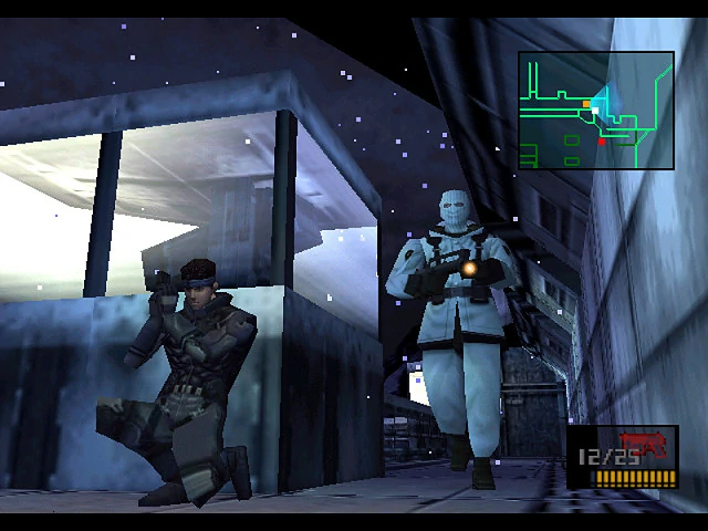
Metal Gear Solid was met with universal acclaim in 1998, and many of its gameplay mechanics were considered revolutionary. If there’s one facet of the game that doesn’t get enough praise, it’s definitely the user interface. No spy thriller would be complete without a abundance of clever gadgets, and Metal Gear Solid doesn’t disappoint in this regard. Managing your inventory in the heat of battle wouldn’t be much fun, so the developers found an elegant way for players select their gear without relying on clunky menu screens. Players can quickly cycle through their weapons and items simply by holding L2 and R2 respectively. This gives them quick access to all of their goodies, and it doesn’t require an obnoxious amount of screen space. Without question, the game’s most notable HUD element is its “solution radar” feature. The radar – which occupies a spot in the top-right corner of the screen – outlines walls and objects that you can potentially hide behind, It also provides you with the location of nearby enemies, and it can even determine a person’s field of vision! At a glance, you’ll be able to tell exactly where your enemies are looking at any given time. It’s fun to sneak past your foes while their heads are turned in the opposite direction, and these kind of daring maneuvers wouldn’t be as viable if it weren’t for the handy radar system. The radar will be jammed if you trigger an alarm or use a chaff grenades, and this only reinforces how helpful it is. Metal Gear 2 used a similar radar system eight years before Metal Gear Soid revolutionized the stealth genre, but MGS has a sleeker interface that’s far less intrusive.
9
Metro 2033
2010
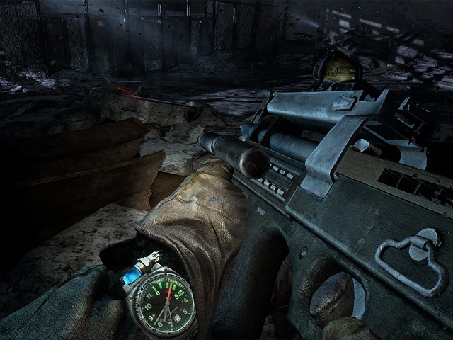
The heads-up display in Metro 2033 is intentionally understated. The developers wanted to create a realistic experience, so they decided to eliminate as many HUD elements as they could. In lieu of a health bar, blood splatters on the screen will indicate how much damage is being inflicted. Artyom’s mask will also fog up in radioactive zones, thus eliminating the need for a Geiger counter. If you want to check the time, you’ll have to look at Artyom’s wrist watch. Likewise, the compass is an in-game object that exists within the narrative structure. Your equipment also provides contextual information without the need for HUD elements, and you can check ammunition levels, voltage, or air pressure by looking at the weapons themselves. Metro 2033 deserves a lot of credit for its sound design too, and players don’t have to rely entirely on visual cues. Artyom’s breathing pattern lets you know when it’s time for a new mask, for example, while the proximity sensor alerts you to the presence of nearby enemies with a distinct ping. There are many ways to feed players information without breaking immersion. The Metro sequels took a similar approach to its HUD, but the original is being recognized on this list for being a trendsetter.
8
Steel Battalion
2002
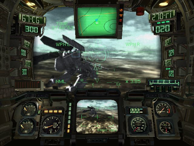
Without question, Steel Battalion has the busiest HUD on this list. Roughly half the screen is covered by gauges, meters, and monitors. This only serves to make the game more realistic, however. Players are given control of walking battle-mechs known as Vertical Tanks, and the cockpit views make you feel like you’re there in person. It seems like information overload at first, but every indicator has a purpose. Without having to enter secondary menu screens, you’ll have have info about your energy, ammunition, and battery levels. There’s also a speedometer, an RPM indicator, and several obstacle warning lamps. Auxiliary monitors are used for everything from night vision to map magnification, and they also make effective radar screens and rear view displays. There’s also a HUD within the HUD, since targeting information is dynamically overlaid on top of the cockpit’s window. It should be noted that the game technically has several HUD designs, as the interface changes depending on which generation of mech you’re piloting. Early models rely heavily on analog gauges and numerical readouts, while later models use additional monitors and projections. The information itself is basically the same regardless of which VT you’re piloting, but it may take some time to adjust to a new layout before you know where everything is. Steel Battalion shipped with an ostentatious controller that housed two joysticks, three foot pedals, five switches, a throttle handle, a radio dial, and dozens of buttons. Every input affects something in the virtual cockpit, and this makes the controller seem a little less ludicrous.
7
Chrono Trigger
1995
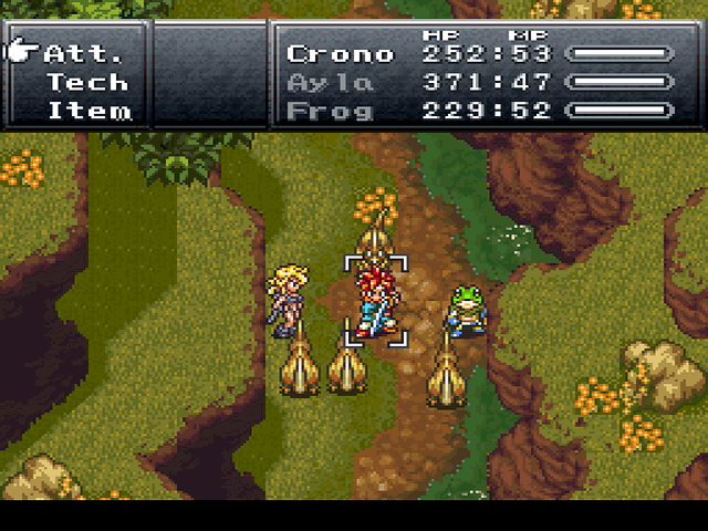
There are a many reasons why Chrono Trigger stood out from the crowd in 1995. In that era, most Japanese RPGs used separate screens for battles and exploration. After encountering an enemy, players would be whisked away to a new screen where the battles would ensue. Chrono Trigger is much more seamless in this regard. When confronted by an enemy, a battle menu simply pops up and the fighting starts immediately. There are no jarring screen transitions, and no separation exists between the exploration sections and the battle sequences. Players can change the position of the battle menu with the push of a button, so it never obstructs your view of the action. When a battle is over, the menu simply slides off screen and you’re free to roam the area once more. This approach makes the adventure feel more cohesive, and it forces you to be more aware of your surroundings. You can usually see your enemies before initiating a battle, and they’ll continue to move around after the fighting starts. If you’re mindful of where everyone is positioned on screen, you can plan your attacks in advance and potentially hit multiple targets at once! The pop-up battle menu is more streamlined than typical JRPG battle screens, and it also allows for a higher degree of complexity in many areas.
6
Fallout 3
2008
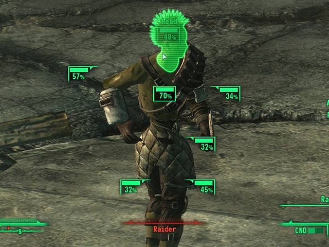
Early Fallout games were defined by isometric graphics and turn-based combat. Fallout 3 represented a major shift in the series due to its implementation of 3D graphics and real-time combat. This change necessitated an entirely new user interface. The HUD gives players all the information they need. Your action points, health, ammunition levels, and weapon condition are always important, so it only makes sense for them to be prominently displayed on the screen. The HUD also has room for a Geiger counter and a compass, which are essential tools for surviving the wasteland. Although there’s a lot of information on screen at any given time, it never feels unnecessary since the details are legitimately important. In addition, players are equipped with a handy electronic device called the Pip-Boy 3000 that allows them to access area maps, manage their inventory, and review their stats. The Pip-Boy was a clever way for the developers to incorporate the menu into the game’s narrative, and I appreciate how the menu screens accentuate the game’s retro-future aesthetic. The coolest part of Fallout 3‘s interface was its dynamic targeting system. Although it looked like an action game, Fallout 3 was still a stat-based RPG beneath the surface. The “Vault-Tec Assisted Targeting System” allows players to slow down the action and target specific body parts. The targeted areas are highlighted in green, and the system displays your enemy’s health and predicts your attack percentage. Although your movement is limited while using the V.A.T.S., the system slows things down so much that you’ll be able to target grenades in the air! Typical action games simply don’t allow for this level of precision. As an added bonus, the V.A.T.S. can reveal enemies that would otherwise go unnoticed. This is especially useful for identifying distant targets or focusing on enemies who are trying to ambush you. The standard HUD, the Pip-Boy menus, and the assisted targeting system compliment each other beautifully, and they illustrate how developers can take a multipronged approach while designing a user interface.
5
Firewatch
2016
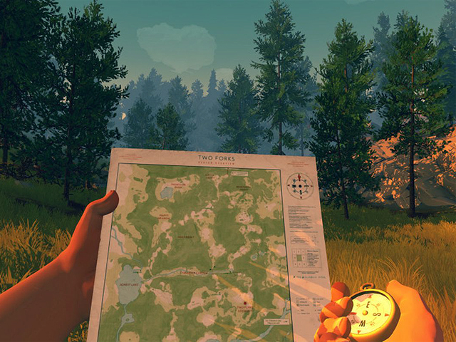
The heads-up display in Firewatch is a brilliant example of diegetic design. This essentially means that the elements that make up the HUD are a tangible part of the in-game universe. Many games feature separate map screens that exist only for the player, and it’s common for mini-maps to be overlaid over the action. Firewatch takes a different approach, as the protagonist is able to handle the map directly with his own hands. You see the paper map through the eyes of your character, and this makes for an immersive experience. The map isn’t crowded with arbitrary icons, and it acts as a frame of reference rather than a set of instructions. Players have to become familiar with the environment in order to find the best routes, and they can’t simply rely on a set of waypoint markers. Players can use a handheld compass if they need help with navigation, and a wave receiver helps them locate items during their adventure. Rest assured, these gadgets are just as tangible as the map is! Firewatch isn’t the first game to implement a diegetic HUD, and Far Cry 2 took a similar approach eight years earlier. Far Cry 2 still had a typical health bar and an ammo meter, however, so it didn’t fully commit to a HUD-less design. In any regard, I always appreciate when developers find clever ways to hide and show information without having to rely on menu options or toggle switches.
4
NieR:Automata
2016
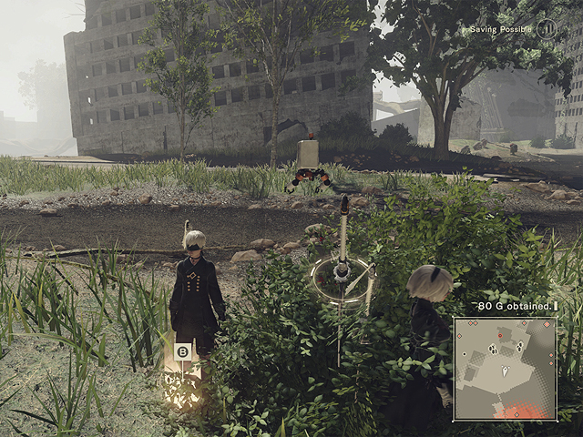
There are different schools of thought when it comes to heads-up displays. Some people want the screen to remain as clean as possible while others want immediate access to information without having to constantly enter menus. NieR:Automata is remarkably flexible in this regard, as it lets players choose what elements will be displayed. The developers even found a way to integrate these options into the narrative. The game focuses on android protagonists which can be customized with various plug-in chips. These chips affect everything from movement speed to drop rates, and they have a meaningful impact on how the game is played. There are a dozen different plug-in chips for the HUD alone, and it’s up to the player to decide which ones are worthwhile. Most of the elements are conventional, and you’ll have different chips to display an HP gauge, damage values, and enemy levels. You also have the option of displaying text logs, a mini-map, and your current objective. You probably won’t use the sound analysis graph very often, and some of the chips feel extraneous. You can’t complain about optional features, however. Lots of games allow players to disable HUD elements, but NieR:Automata actually gives you an incentive to do so. By limiting the number of HUD chips you have equipped, you can allocate the space for more useful upgrades.
3
Persona 5
2016
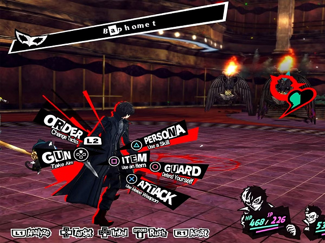
Conventional wisdom holds that a user interface should be as unobtrusive as possible. Developers often choose small font sizes and muted colors to avoid breaking immersion, and it’s common for HUD elements to be pushed to the extremities of the screen where they’ll be less distracting. The Persona games make no effort to obfuscate their menus, and they sometimes make you feel like you’re looking at an animated manga panel. This is especially true of Persona 5. The user interface employs huge letters and bright colors, and the command menus often occupy the center of the screen. It’s as though the designers went out of their way to make the HUD elements as noticeable as possible. Text boxes are accentuated by animation while menu selections are underscored with color. If nothing else, Atlus deserves credit for creating one of gaming’s most readable interfaces. Eveything is vibrant, loud, and in-your-face. Developers are often willing to sacrifice playability in order to cultivate a cinematic experience, but Persona 5 never hides the fact that it’s a video game. The menus are just as stylish as the characters, and everything is tied together with a unified art style.
2
Dead Space
2008
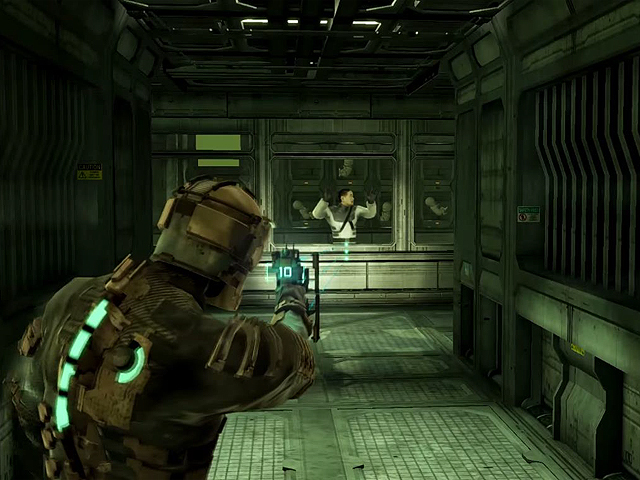
In first-person games, designers are able to show information to the player and their character simultaneously. HUD elements in third-person games are typically there for the benefit of the player, however, and the in-game characters wouldn’t even be aware of their existence. Dead Space is a rare example of a third-person game that uses a diagetic user interface. The HUD elements don’t float in imaginary space between the player and the game. Instead, they’re a tangible part of the fictional universe. The character’s health is indicated by segments of colorful lights that run down the spine of their spacesuit. The suit also features a circular statis meter and an oxygen indicator. This information is readily available to the player without distraction, and it’s a believable part of the game’s universe since the elements can also be perceived by the characters themselves. The ammunition levels are clearly displayed on the weapons, and supplementary modules are plainly visible on the character’s arms. There’s also a diegetic inventory screen in the form of a floating hologram that’s visible to players and in-game characters alike. These HUD elements skirt the line between the subtle and the conspicuous, and they let you immerse yourself in the fictional universe without constantly reminding you that you’re playing a game.
1
Metroid Prime
2002
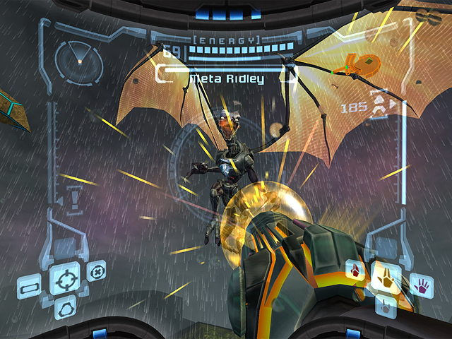
Retro Studios faced many challenges while working on Metroid Prime, but the game also created many opportunities for the developers. Ultimately, the first-person view allowed them to build a more immersive experience for the player. You’re able to view the world through Samus Aran’s visor, and the heads-up display simulates the inside of her helmet. In addition to an aiming reticule, the display features a radar, a map, and separate readouts for ammunition, missiles, and health. Samus can also change visors to activate thermal imaging or x-ray vision. One of the visors can scan enemies for weaknesses or extract information from the surrounding environment. The HUD gives players a tremendous amount of information, but it also makes them feel more connected to the world around them. You’ll have insight about everything from surface temperatures to skeletal densities, but it never feels overwhelming since the individual visors each have their own unique functions. The attention to detail is astounding, and there are so many subtle visual cues that make the HUD seem even more realistic. Water builds up on the visor when it rains, for example, and the effect is amplified when you look up. In other instances, sudden changes in temperature will cause the visor to fog up. You can even see the reflection of Samus’ eyes in the visor when you’re standing close to an explosion! When Metroid Prime was released for the Switch in 2023, many assumed that these effects were created specifically for the remastered version. That gives you an idea of how groundbreaking the game felt upon its initial release in 2002.





Do you agree with this list? Let us know what you think by leaving a comment below. Your opinion matters!