Worst Box Art
Top 10 Examples of Bad Video Box Art!
It was easy to make a list recognizing great box art, but choosing bad box art is a little more complicated. There are countless forum threads, social media accounts, and entire websites dedicated to bad box art. Narrowing the field down to ten is difficult because there are so many contributing factors to consider. Some covers are poorly-drawn, some are confusing, and some are unintentionally hilarious. People tend to judge books by their cover, but many video game publishers apparently missed the memo. Click the images for a full preview!
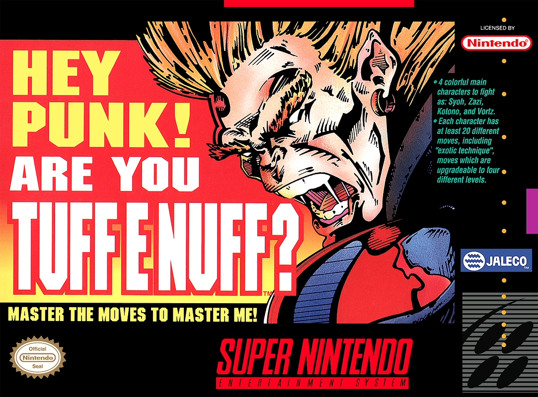
10
Tuff E Nuff
1993
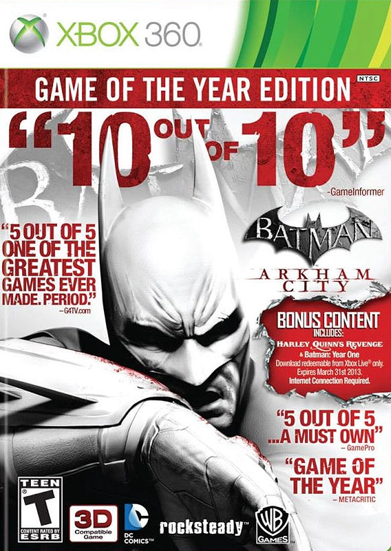
A lot of publishers feel the need to shove as many words onto a game cover as they can. The ‘Game of the Year’ edition of Arkham City was pretty bad in this regard, but Tuff E Nuff is an especially egregious example. The box is so crowded with words that the name of the game isn’t even clear. Did Jaleco actually think they could trick people into buying the game by having some random ogre-dude call them out? I can’t imagine too many kids saw the game on the shelf back in 1993 and thought, “So that random guy on the box doesn’t think I’m Tuff E Nuff, hey? I’ll show him! I’ll master the moves to master him!”
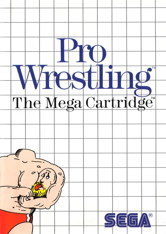
9
Pro Wrestling
1986
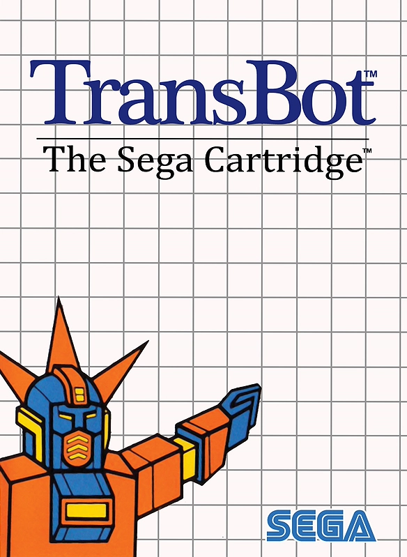
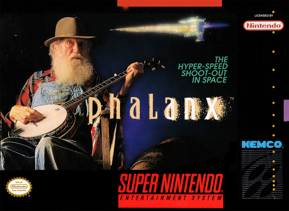
Sega Master System box art didn’t always make a lot of sense – TransBot featured a Nazi robot for some reason – but Pro Wrestling was especially confusing. I might be looking at things wrong, but it appears that the wrestler somehow ripped off his own head! Would a headlock really be the most effective move to use against a disembodied head? Why wouldn’t he just kick it like a soccer ball? Confusing box art can help a game stand out on store shelves (that was the intent behind the legendary Phalanx cover), but I legitimately don’t understand what’s happening on the cover of Pro Wrestling.
8
Xenon 2 Megablast
1989
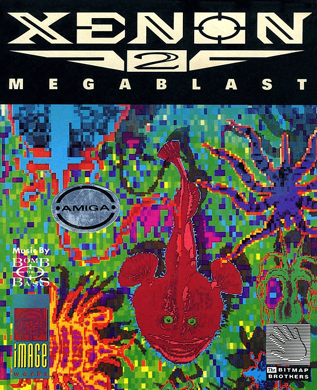
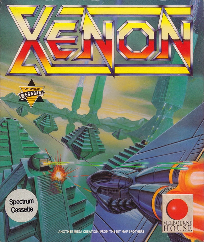
The cover for the first Xenon was pretty typical for a shoot ’em up, but the sequel was decidedly more experimental. To be blunt, the box art looks like a visual representation of an epileptic seizure. When you look at how the clashing colors bleed into each other, you’d almost wonder if the art was the result of an unfortunate printing error. The in-game graphics actually look better than the artwork on the box! The art was also used in the game’s ad campaign, so someone clearly had faith in it. I suppose you could pass the art off as some kind of avant-garde bullshit if you really wanted to, but the logo placement is downright tacky any way you slice it.
7
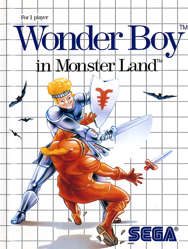
Wonder Boy in Monster Land
1987
During the 8-bit era, it wasn’t unusual for there to be a disconnect between how a character looked in-game and how they were depicted in official artwork. That being said, I don’t think anyone was expecting Sega to depict Wonder Boy as a sociopath. His yellow pompadour and totally ’80s sweatband are easy targets for ridicule, but I can’t get over the disturbed expressions on his face. He’s taking way too much pleasure in knocking that knight out, and the psychotic look in his eyes suggests that he has spent considerable time playing this exact situation out in his mind. “Stop! stop! He’s already dead!”
6
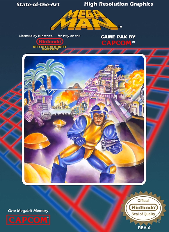
Mega Man
1987
Mega Man is an adorable android who draws heavy inspiration from Astro Boy, but the North American box art portrays him as a middle-aged man in a polyester sweat suit who had apparently just finished riding a horse. If you’re wondering why he has a visor and a hand gun, it’s because the artist was clearly rushed and didn’t get a chance to play the game before designing the cover. That old guy on the cover could never win a fight against Dr. Wily’s renegade robot bosses. Heck, he’d be lucky to win his battle with Alzheimer’s! This cover was so notorious that Capcom felt compelled to include “Bad Box Art Mega Man” as a playable character in Street Fighter X Tekken.
5
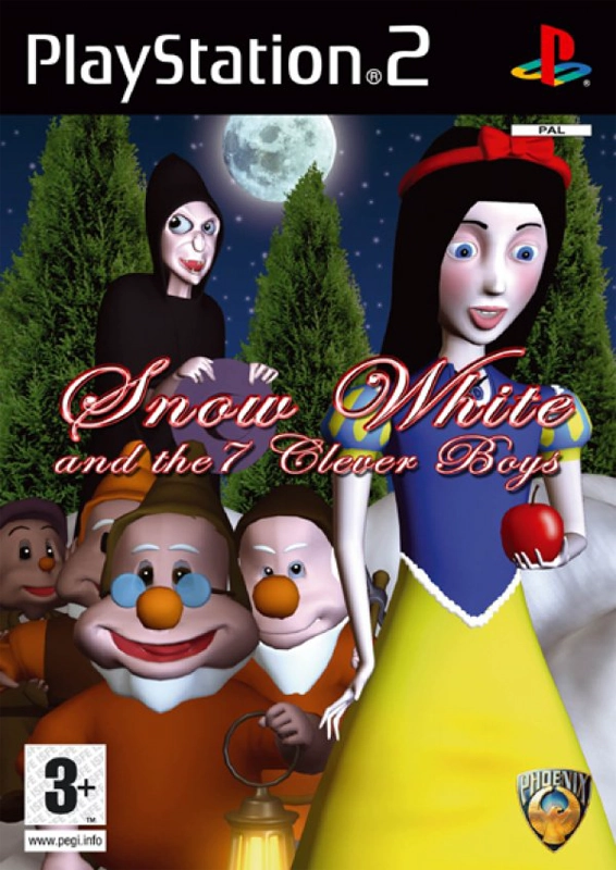
Snow White and the 7 Clever Boys
2006
Phoenix specialized in wholesale copyright infringement and it was common for them to steal assets from other companies. Their version of Snow White was clearly inspired by Disney’s animated classic. Incidentally, their version of the eponymous maiden is apparently inflicted with congenital birth defects. On a related note, I don’t remember the dwarfs from Disney’s film looking like junkies with a glazed-over eyes. The background is also noteworthy. It’s apparent that the artist did a quick Google search for “moon” and “pine tree” and quickly pasted everything together in whatever knockoff version of Photoshop they had access to.
4
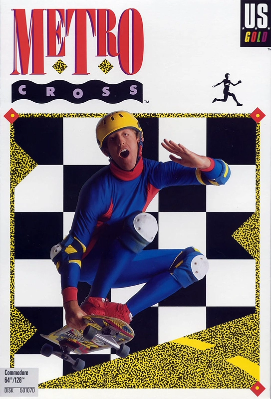
Metro Cross
1987
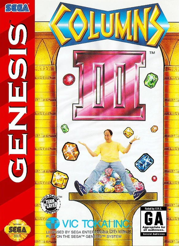
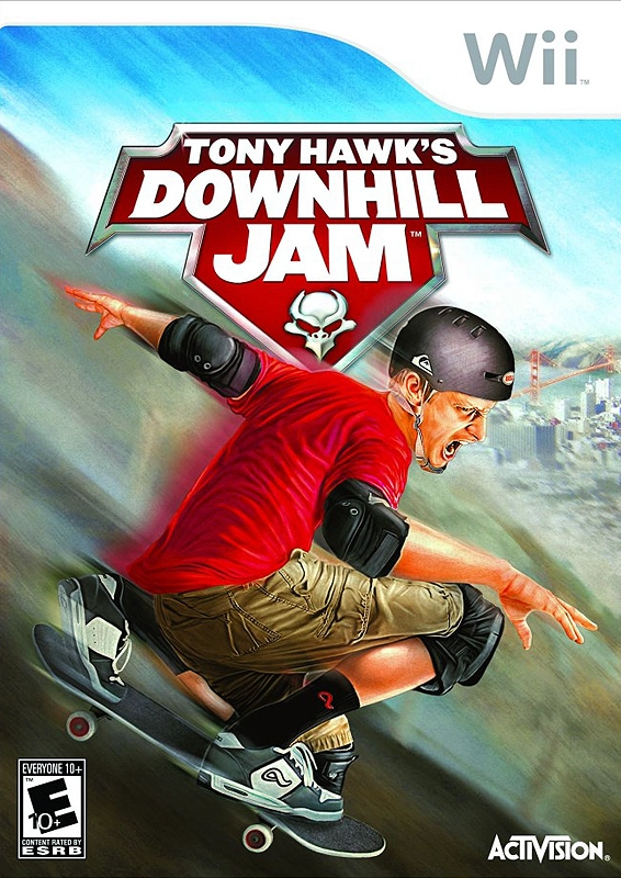
Metro Cross was released before the whole “extreme sports” sub-culture became part of the mainstream, and I understand that there weren’t an abundance of skaters at the time that had achieved the celebrity of someone like Tony Hawk. Still, I can’t help but think that U.S. Gold could have found someone who looked like they had been on a skateboard before. Simply put, the guy on the cover doesn’t look like he knows what he’s doing. He might be the worst cover model I’ve ever seen – and that includes the guy from the Columns III box that pissed himself. In fairness, the Metro Cross cover isn’t that much goofier than Tony Hawk’s Downhill Jam.
3
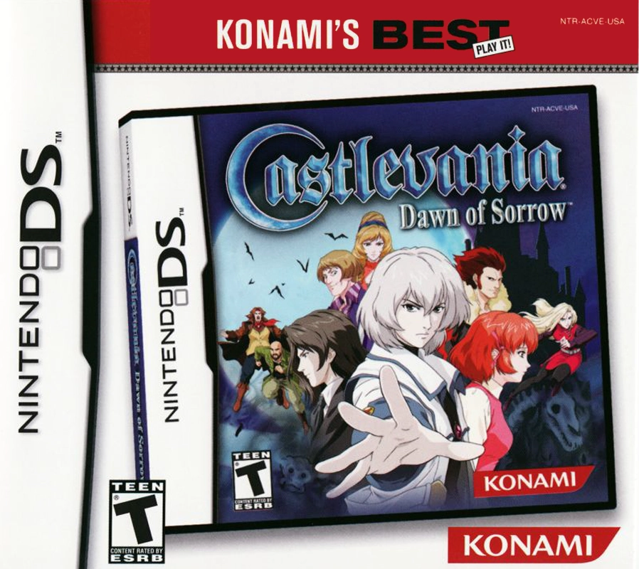
Castlevania: Dawn of Sorrow
2006
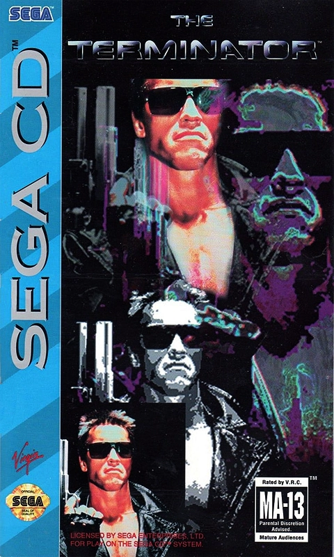
When games are re-issued as “Greatest Hits” titles, unsightly banners are often plastered over the original art. With Dawn of Sorrow, Konami decided to take things a step further by adopting a bizarre “box-within-a-box” motif for some unknown reason. They basically just took a picture of the original box and put it on the new box. The redundancy of the Nintendo DS logo and ESRB rating is completely ridiculous. If this version sold enough, would we have seen another re-release featuring a box-within-a-box-within-a-box? Was this just a new bizarre way for Konami to track sales? This level of recursion surpasses the Sega CD version of The Terminator.
2
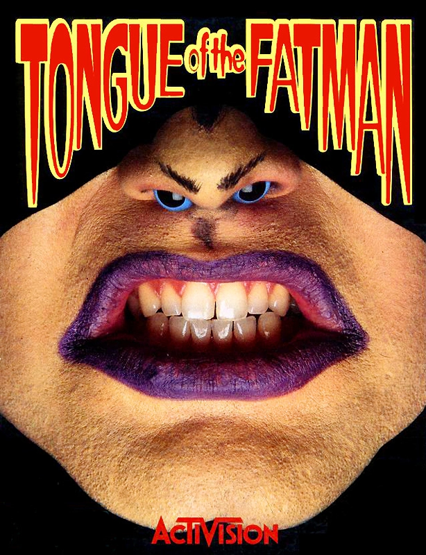
Tongue of the Fatman
1989
“Should we hire an artist to design a cover for our game, or should I just bust out some purple lipstick and put googly eyes up my nose?” I can’t imagine what Activision was thinking, but I’m guessing the end result didn’t turn out like they envisioned. If your best idea involves shoving things up your nose, it’s probably time to go back to the drawing board. They probably saved a few bucks on the cover design, but I’m sure it cost them sales in the long run. Tongue of the Fatman is a weird game, but it wasn’t nearly as bizarre as the box art suggested. Interestingly, the Mega Drive box art was legitimately awesome and looked like the cover of a 1980s comic book.
1
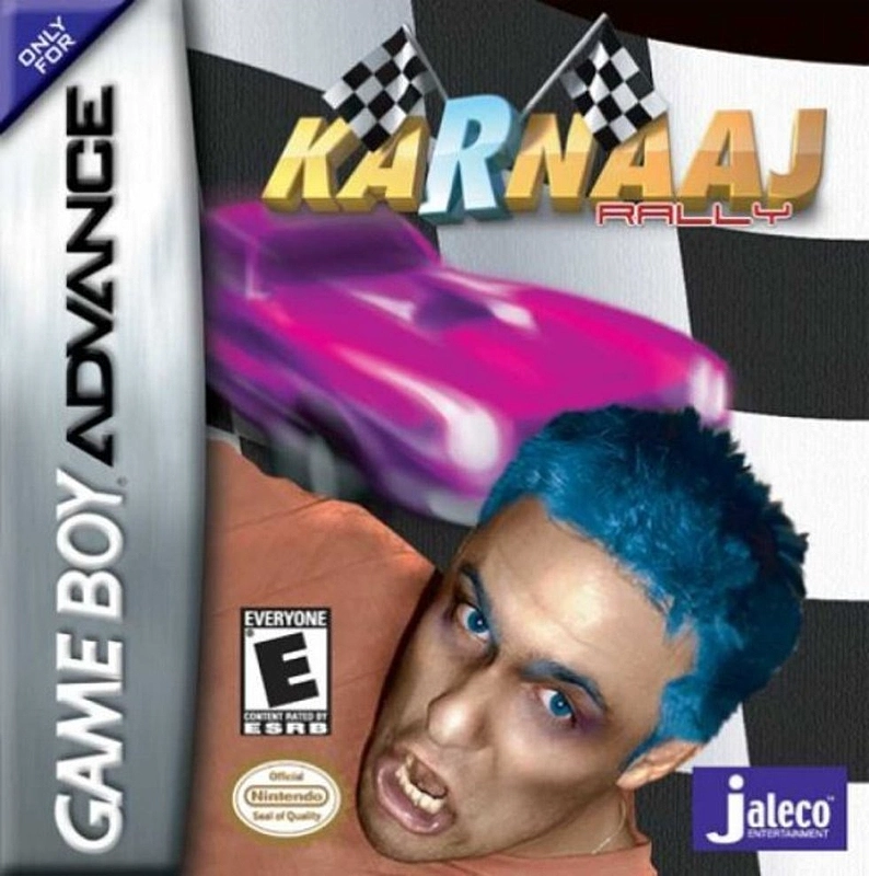
Karnaaj Rally
2002
It’s pretty common for game covers to feature beautiful women who don’t actually appear in the game, but I don’t understand who Jaleco was trying to appeal to by making a random blue-haired dude the face of their game. Perhaps they were trying to tell us that Karnaaj Rally was the most extreme game ever! The purple hot rod in the background is going so fast that you can barely see it! If that doesn’t convince you that this game is extreme, then the alternate spelling of “carnage” certainly should. There’s a lot to make fun of here, but it seems wrong to poke fun at a guy who is so obviously a rape victim.
Published: January 23, 2018
Do you agree with this list? Let us know what you think by leaving a comment below. Your opinion matters!